I built per-stat tower upgrades, then deleted them by dinner
A 'strictly richer' upgrade system that was strictly worse to play. The bug wasn't the depth — it was asking the player to think during the one moment they can't. Here's why, and where the depth went instead.
The tower upgrades in Overserved were one button. Level 1, 2, 3. Click, click, done. I looked at that and thought: too shallow. So I spent the morning making it deeper, and the afternoon ripping that depth back out. The work was good. The judgment was the problem.
The “better” version
Forget a single bump. Give every tower three independent tracks — pump damage for a brawl, stack range for a long lane, crank speed against a swarm — plus a unique special on top, refunds if you changed your mind, all capped under a permanent upgrade tree so there’s a real meta to chase.
On paper this is just more game: more knobs, more builds, more of those “what if I went all-range on this map” runs players narrate to themselves. I rewrote the upgrade data layer, wired the per-stat tracks, built a tabbed shop for the permanent tree. By lunch it worked, and it was richer by every measurable axis.
Then I actually played it
Tower defense is a game about tempo. You’re reading the board, watching the lane, placing towers, reacting to what’s about to leak. The fun is being slightly behind and catching up. It lives entirely in the present tense.
Here’s what my shiny system now asked, mid-wave, with a swarm bearing down: select the tower, open a dialog, read three rows of stats, decide which axis is worth my money right now, click. Every upgrade. Every time.
It functioned perfectly and it was miserable to play. The reason is worth naming, because it’s the whole lesson: a real choice has a cost even when the UI is fast. Damage-vs-range isn’t a button press, it’s a decision — you have to model the wave, weigh the options, commit. That’s deliberate, slow thinking, and I’d wedged it into the exact two seconds the game needs you reacting on instinct. The two modes don’t share a brain. So every upgrade became a hard stop: I’d be optimizing a stat spread while the thing I was defending quietly burned. The dialog didn’t add depth to the moment. It taxed the moment to fund depth I had no spare attention to enjoy.
The playtester’s verdict was blunter than mine: too granular, breaks the flow, in-run upgrades should be one quick click. No dialog. I’d built exactly the thing that was wrong, and I’d been too proud of the engineering to feel it until someone else said it out loud.
The delete, and where the depth went
So I tore the in-run half out. One click on the floating upgrade icon now bumps every stat, Level 1 to 3 — same as that morning, no decision tax.
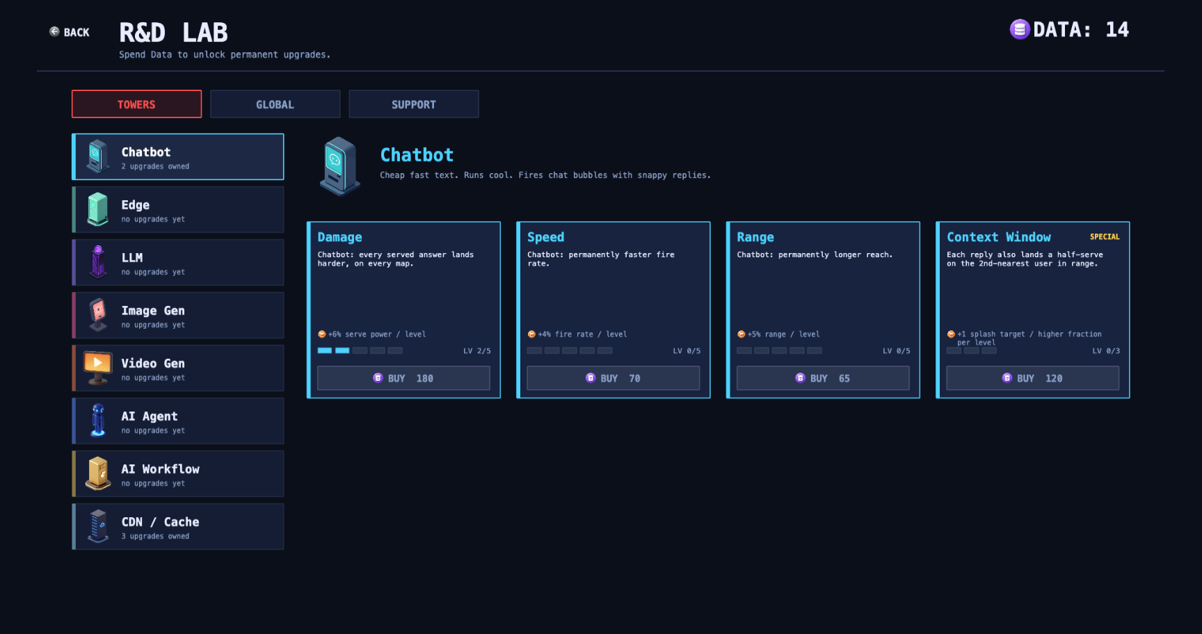
But here’s the part I almost missed while sulking: I didn’t have to throw the depth away. A choice that’s friction in the heat of a wave is a treat in a calm planning screen. So the granular stuff — the damage/speed/range investment, the per-tower specials — moved into the permanent upgrade tree, the between-runs shop. Same exact decisions. Completely different feel.
The difference is what the player is doing around the choice. In the shop there’s no swarm, no clock, no thing burning down. Deciding is the activity — you’ve got coffee and a quiet screen and you’re planning your next run, pouring points into range or unlocking a special that auto-applies to every tower you place. Now the deliberate, slow part of your brain is the only part in the room. That’s why the same knobs that felt like paperwork in-run feel like theorycraft in the tree. Roguelikes lean on this split hard — twitchy during the run, strategic between runs — and I’d just rediscovered why.
What it taught me
More granularity is not more fun. A system can be richer on the spec sheet and worse the second a human touches it, because “depth” isn’t a property of the feature — it’s a property of the feature and the moment you ask for it. The fix is almost never to dumb the game down. It’s to ask when the decision happens, and move it somewhere the player has the attention to spend. Don’t delete the depth. Relocate it.
And the fastest way I know to learn a dialog is wrong is to build it, play it, and hate it. Sunk cost is not a design argument — but it’s a pretty good teacher. Best decision I made that day was hitting delete on my own best work.