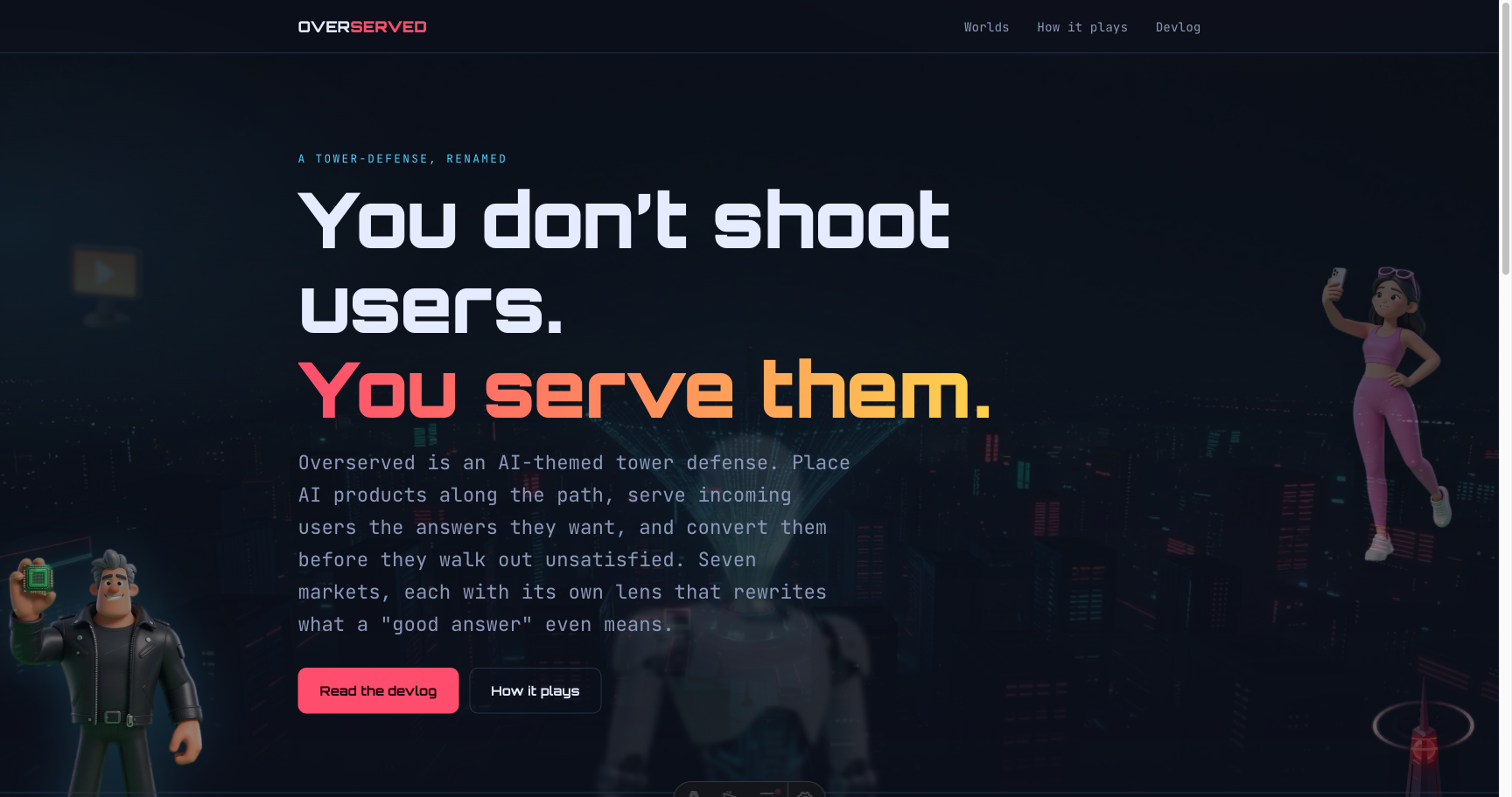
I put the game in the page's margins
My landing page was a tidy column marooned in two oceans of empty navy. So I filled the gutters with the game's cast — a depth-layered parallax field — and learned that 'depth' is four things moving at once, and that two transforms on one element will always fight.
The landing page was a clean centered column. On my laptop it looked fine. On a wide monitor it looked like a paragraph marooned in two oceans of empty navy — a tidy 1080px of content with a third of the screen dead on either side. That waste bugged me every time I opened it.
Meanwhile the game has a whole cast — bosses, users, a sinister glowing obelisk — sitting in the repo, doing nothing for the page that’s supposed to sell them. So I put them in the margins.
Depth is four things at once
A flat scatter of cut-out characters in the gutters reads as clutter, not atmosphere. What makes it read as depth is layers — and the trick people miss is that you have to change everything per layer, not one thing. I split the cast into three planes:
- near — big (~190px), sharp, a coloured glow, scrolls fast.
- mid — medium, a soft drop-shadow, scrolls at a middling rate.
- far — small (~85px), 2px of blur, dropped to 22% opacity, scrolls slow.
Size or blur or opacity alone gives you a sticker. Size and blur and opacity and scroll speed, all moving together, and your eye just buys a third dimension. That’s the whole illusion.
The parallax itself is deliberately boring: on scroll, each piece gets a transform: translateY of
scrollY × its own rate. A negative rate makes it lead the scroll, so it feels close; a positive rate
makes it lag, so it feels far away. One passive scroll listener, throttled through requestAnimationFrame,
writing only transform — never top or width — so it stays on the GPU and never triggers layout.
The two animations that fought
Here’s the bug that ate twenty minutes. I also wanted each piece to breathe — a slow idle float, up and
down — layered on top of the parallax. So I had a CSS keyframe animating transform: translateY, and my
JavaScript also writing transform: translateY for the parallax. Same property, same element. The last
writer wins. So the float stomped the parallax, or the parallax froze the float, depending on which fired
that frame. Janky either way, and impossible to tune.
The fix is almost too dumb to write down: don’t put two transforms on one element. Nest them. The outer box takes the JavaScript parallax; an inner box runs the CSS float; the image sits inside that. Each element owns exactly one transform and never touches the other’s. It’s the same lesson every single time CSS and JS want to animate the same thing — give them separate boxes and they stop arguing.
The robot problem
First pass, I lined the gutters with the splashiest art I had: the boss androids. They looked incredible on the contact sheet. On the actual page, a chrome humanoid hovering next to “you serve them” read as a robot — wrong story, since the whole pitch is that the things you serve are users. Worse, two big figures stacked on the right edge overlapped into a single ten-limbed blob.
So I pulled the androids out of the rails completely and left the gutters to the humans — the influencer, the gold-chained whale, the kid, the suits. The one android I couldn’t part with, I demoted instead: blown up huge, blurred, dropped to 12% opacity, and parked dead-centre behind the headline. Now it isn’t a character loitering in the margin — it’s a presence the entire hero sits inside. The AI you’re about to serve, looming behind the words. Same asset, completely different job.
Knowing when to disappear
The whole effect is a luxury for wide screens, and it should act like one. The content column is ~1080px;
the drift only lives in whatever’s left over. On a phone there’s nothing left over, so it’s simply gone —
display: none below 1200px, no apologetic half-version. The big near-layer bosses need even more room, so
they don’t appear until 1400px. And all of it is wrapped in prefers-reduced-motion: if you’ve told your
OS to settle down, the scroll listener never attaches and the float never starts — the pieces just sit
there, still and perfectly visible.
A decoration that crowds the text, jitters on a phone, or moves after someone asked it not to isn’t a decoration. It’s a bug with nice art.
The page used to be a column in a void. Now the void has the cast drifting through it at three depths, with the thing you’re about to serve watching from behind the headline. Same content, same column — I just stopped throwing away the edges.